'%20stroke='url(%23textGrad)'%20stroke-width='2'/%3e%3c!--%20Hand-drawn%20H%20path%20--%3e%3cpath%20d='M%2038%2032%20Q%2032%2060%2036%2082%20M%2035%2062%20Q%2052%2055%2072%2044%20M%2068%2028%20Q%2065%2060%2072%2082'%20fill='none'%20stroke='url(%23textGrad)'%20stroke-width='3'%20stroke-linecap='round'%20stroke-linejoin='round'%20filter='url(%23glow)'%20/%3e%3c/svg%3e)
modal 과 popover 를 API 로 제공한다는 것을 최근에 알았다. 그 전까지는 코드로 구현을 했었는데..
Dialog
developer.mozilla.org
<dialog> HTML dialog element - HTML | MDN
The <dialog> HTML element represents a modal or non-modal dialog box or other interactive component, such as a dismissible alert, inspector, or subwindow.
<button id="open-btn">설정 열기</button>

<dialog id="settings-dialog">
  <form method="dialog">
    <h3>설정</h3>
    <p>변경사항을 저장하시겠습니까?</p>
    <button value="cancel">취소</button>
    <button value="confirm">확인</button>
  </form>
</dialog>

<script>
  const dialog = document.querySelector('#settings-dialog');
  document.querySelector('#open-btn').addEventListener('click', () => {
    dialog.showModal(); // Top Layer 모달 띄우기
  });
</script>
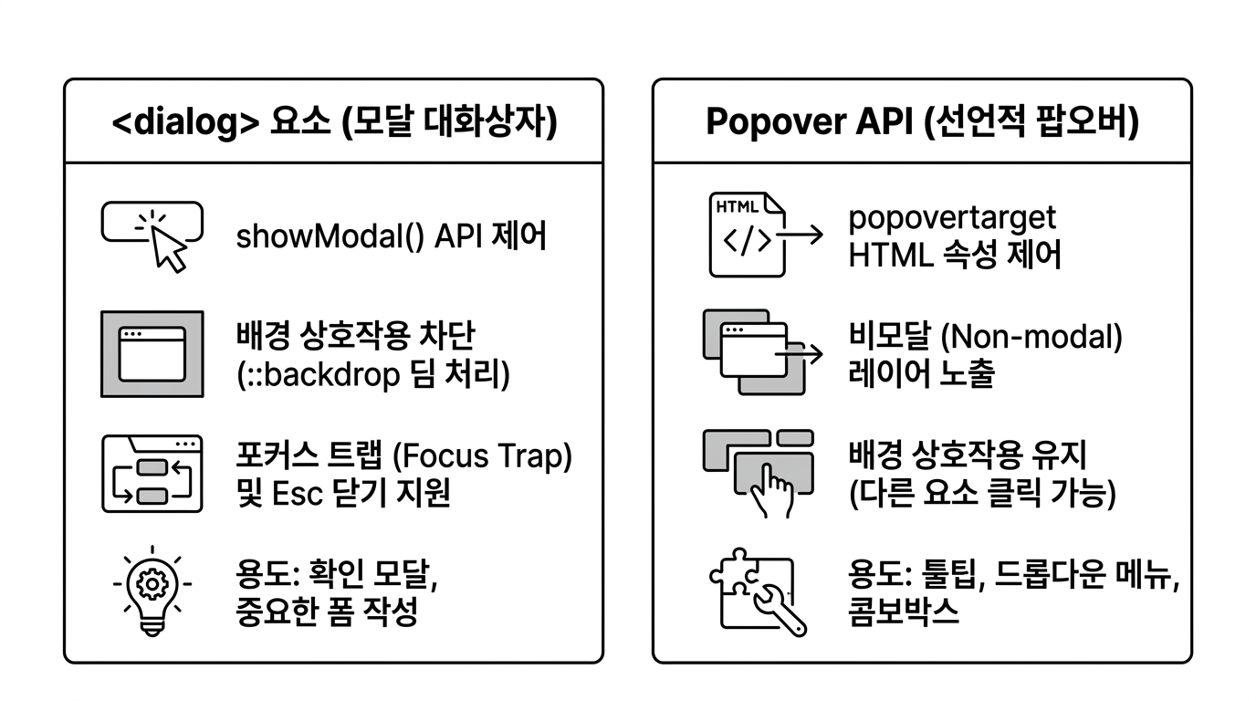
<dialog> 는 showModal()과 show() 를 통해 모달과 비모달 상태를 명확히 분리한다. 모달로 띄우면 상호작용이 끝날 때까지 외부 입력이 차단된다.
| 기준 | showModal() | show() |
|---|---|---|
| 모달 여부 | 모달 (외부 클릭/입력 차단) | 비모달 (외부 클릭/입력 허용) |
| 레이어 위치 | 브라우저 최상위 Top Layer | 일반 DOM 레이어 |
| 배경 암전 | ::backdrop 의사 요소 제공 | 백드롭 없음 |
| 포커스 이동 | 내부로 포커스 자동 이동 및 가둠 | 포커스 이동 없음 |
<form method="dialog">를 내부에 사용하면, 폼 내부의 버튼을 누를 때 코드 작성 없이도 다이얼로그가 자동으로 닫힌다. 버튼의 value가 dialog.returnValue로 전달되는 구조.
Dialog 배경 클릭 시 닫기
모달 다이얼로그는 기본적으로 Esc 키로 닫히지만, 배경 쪽 ::backdrop 을 눌렀을 때 자동으로 닫히지는 않는다. 배경 클릭 닫기를 구현하려면 다이얼로그에 클릭 이벤트에서 배경 클릭한 걸 영역을 계산해 판별해야 한다.
dialog.addEventListener('click', (event) => {
  const rect = dialog.getBoundingClientRect();
  const isClickOutside = (
    event.clientX < rect.left ||
    event.clientX > rect.right ||
    event.clientY < rect.top ||
    event.clientY > rect.bottom
  );

  if (isClickOutside) {
    dialog.close();
  }
});
Popover
developer.mozilla.org
Popover API - Web APIs | MDN
The Popover API provides developers with a standard, consistent, flexible mechanism for displaying popover content on top of other page content. Popover content can be controlled either using HTML attributes, or via JavaScript.
<!-- 버튼에 popovertarget 지정 -->
<button popovertarget="profile-menu">프로필 메뉴</button>

<!-- 팝오버 대상 요소 -->
<div id="profile-menu" popover>
  <button type="button">프로필 수정</button>
  <button type="button">로그아웃</button>
</div>
popover 속성은 태그 요소가 아니라 어떤 요소에나 붙일 수 있는 전역 속성이다. 버튼의 popovertarget과 조합하면 코드 한 줄 없이도 드롭다운이나 툴팁을 띄울 수 있다.
- 기본 동작은
popover="auto"로 외부 바깥 영역을 클릭하거나Esc키를 누르면 브라우저가 알아서 팝오버를 닫아준다. - 여러 팝오버를 동시에 띄우기. 바깥 클릭으로 닫히지 않아야 할 때.
popover="manual"로 설정 - 부모의
overflow: hidden이나z-indexStacking Context 에 갇히지 않고 항상 최상위 레이어에 뜨게 됨
Anchor Positioning
developer.mozilla.org
CSS anchor positioning - CSS | MDN
The CSS anchor positioning module defines features that allow you to tether elements together. Certain elements are defined as anchor elements; anchor-positioned elements can then have their size and position set based on the size and location of the anchor elements to which they are bound.
팝오버를 열 때 중요한 것 트리거 바로 아래에 팝오버를 위치시키는 것이었다. Anchor Positioning을 사용하면 팝오버 위치를 순수 CSS로 기준 버튼에 고정할 수 있다.
/* 기준 버튼에 앵커 이름 부여 */
#menu-button {
  anchor-name: --menu-btn;
}

/* 팝오버 요소를 기준 버튼 아래에 고정 */
#profile-menu {
  position: fixed;
  position-anchor: --menu-btn;
  top: anchor(bottom);
  left: anchor(left);
  margin-top: 4px;
}
<button id="menu-button" popovertarget="profile-menu">메뉴</button>
<div id="profile-menu" popover>팝오버 내용</div>
세상 좋아졌다..
댓글 0개